


Table of Contents --
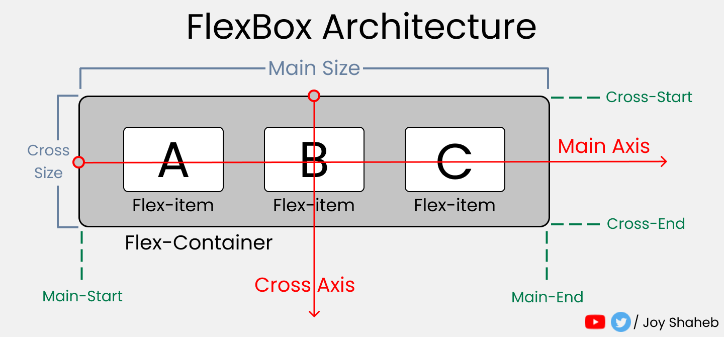
- FlexBox Architecture
- flex-direction
- justify-content
- align-content
- align-items
- align-self
- flex - grow | shrink | wrap
- Short Hands
- Conclusion
It's 2021! Let's refresh Our CSS Flexbox Memory. Here's a Cheat Sheet of everything you can do with CSS flexbox to get started in 2021.
FlexBox Architecture
FlexBox Chart --
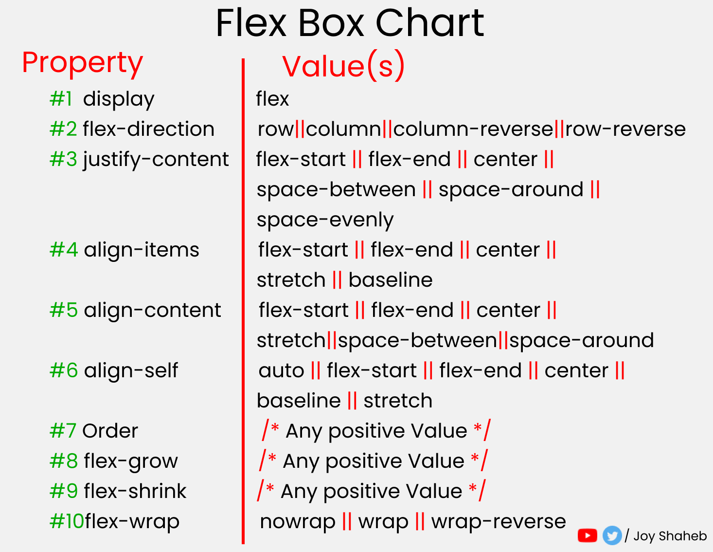
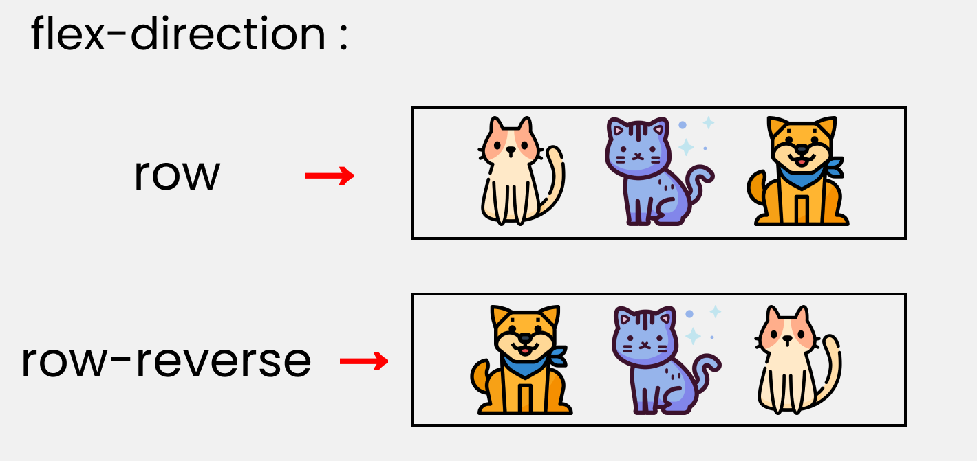
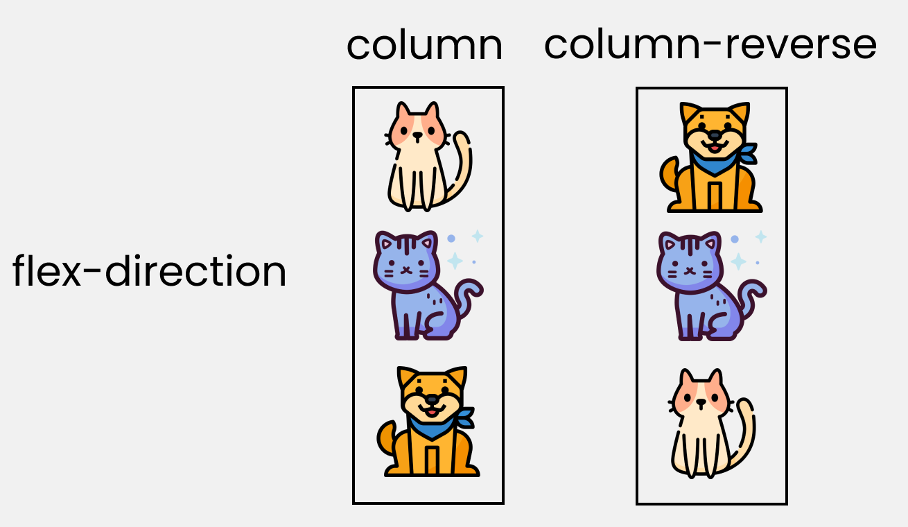
flex-direction
The Direction/Orientation in which flex-items are distributed inside flex-container.
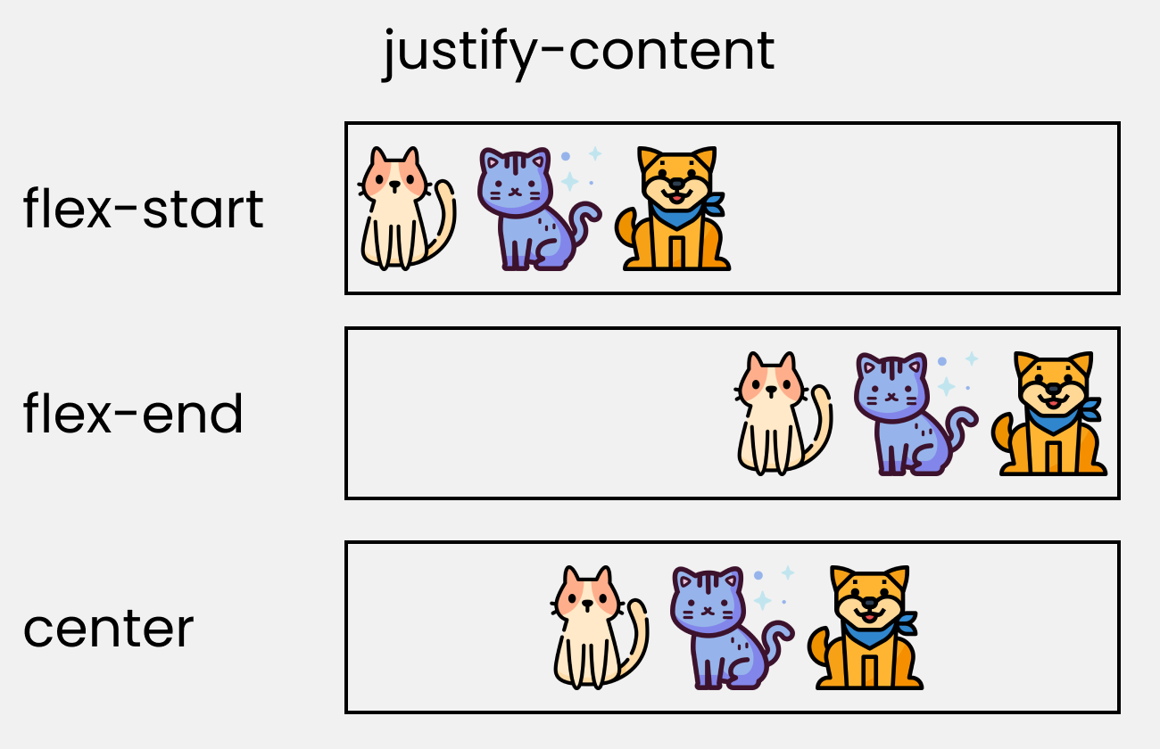
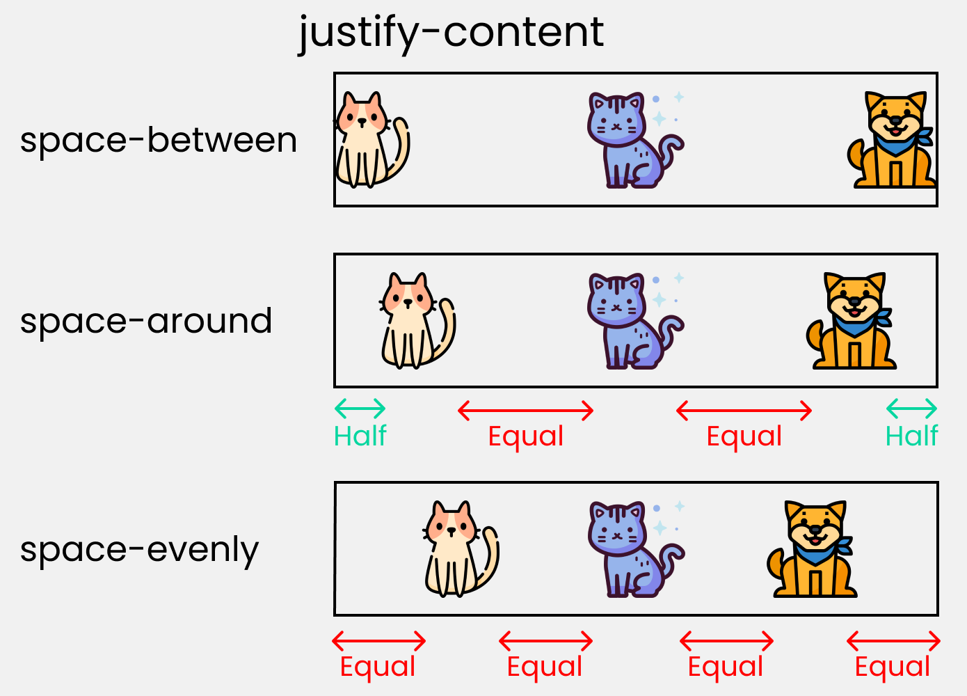
justify-content
This property arranges flex-items along the MAIN AXIS inside the flex-container
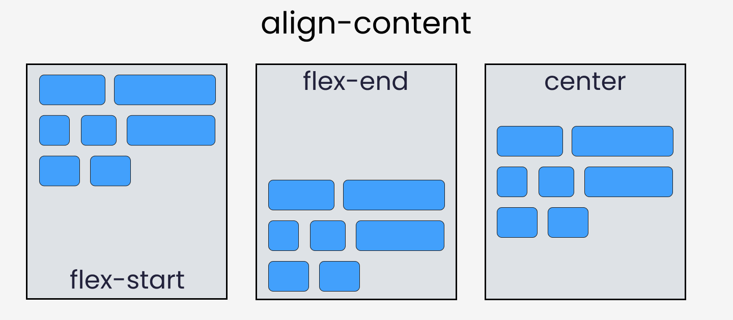
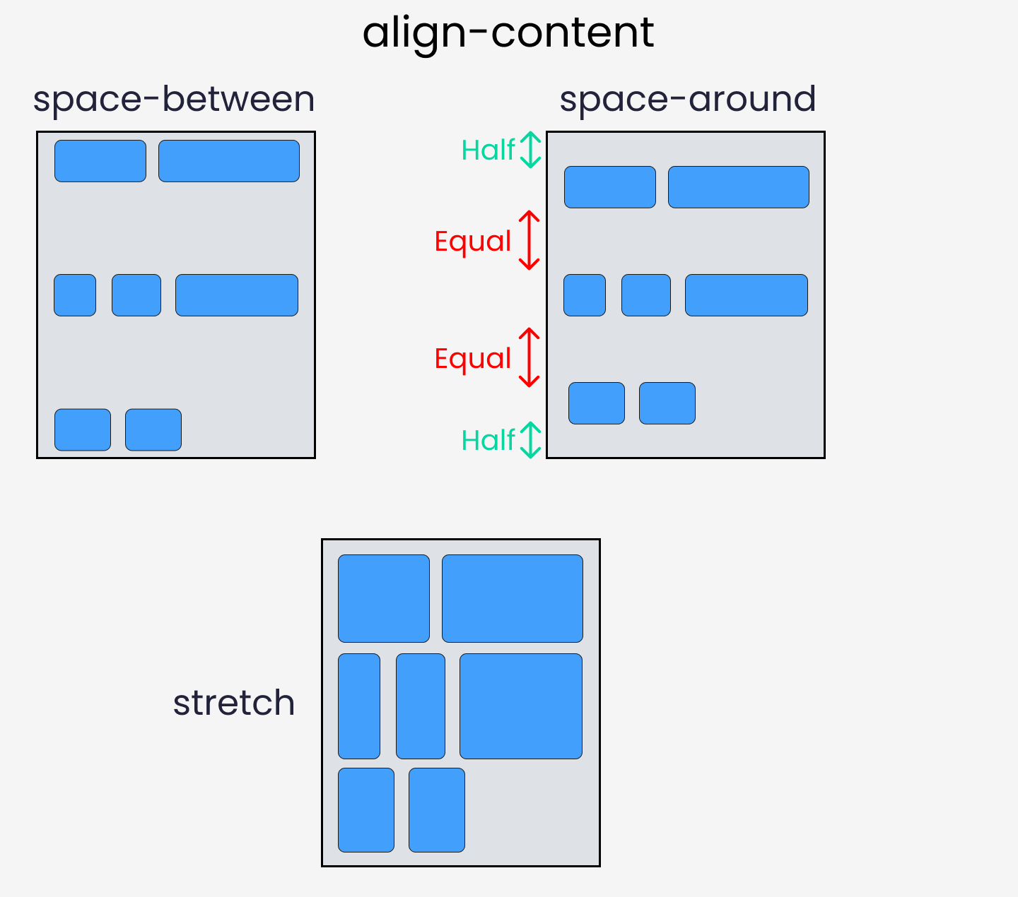
align-content
This property arranges flex-items along the CROSS AXIS inside the flex-container. This is similar to justify-content
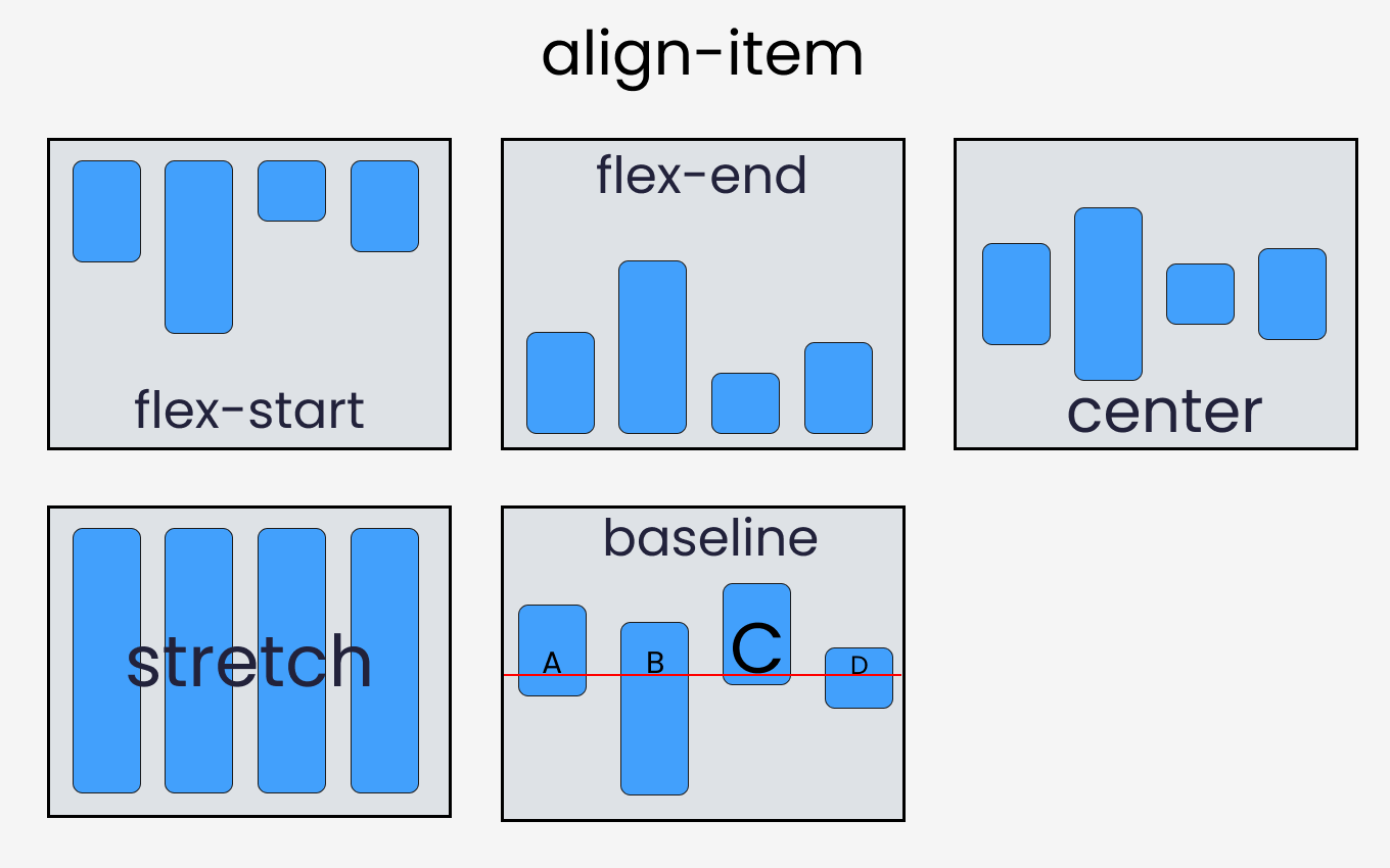
align-items
Distributes Flex-items along the Cross Axis
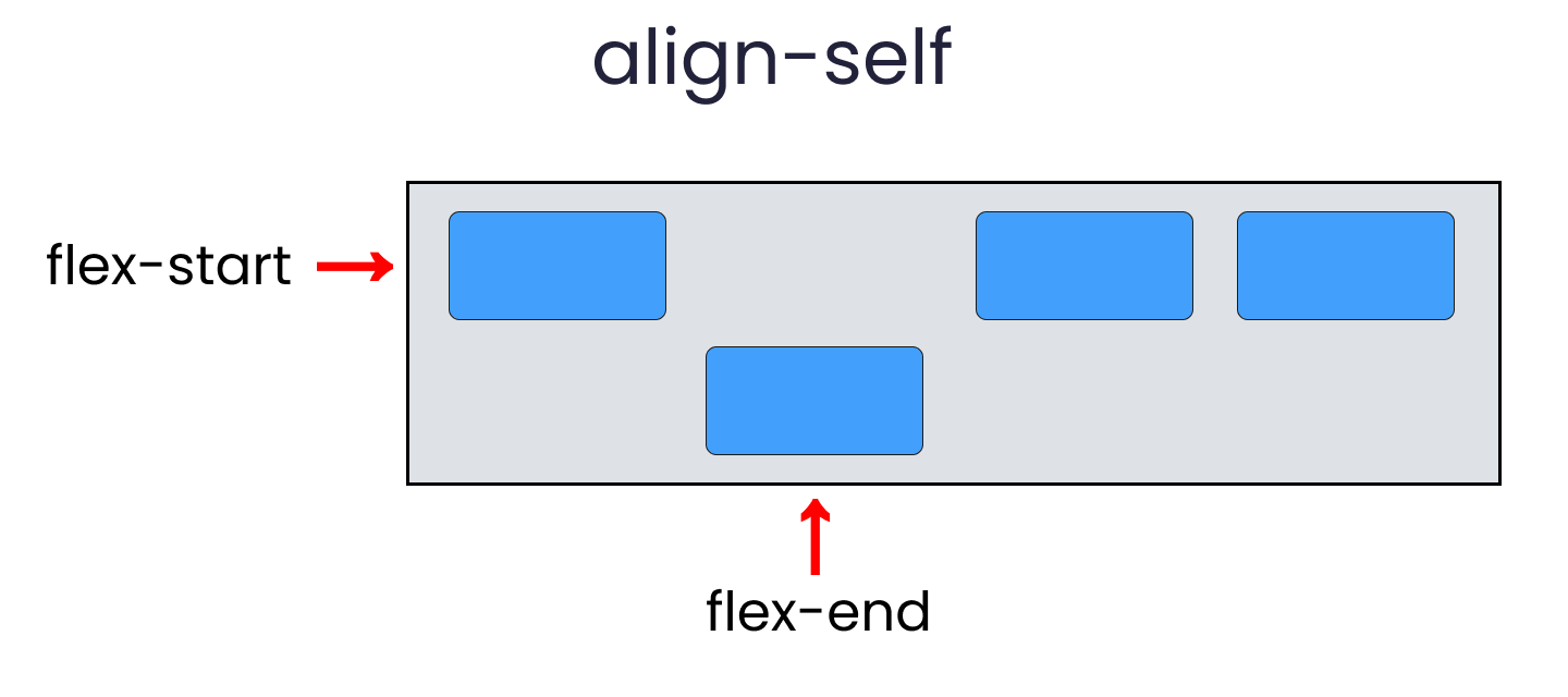
align-self
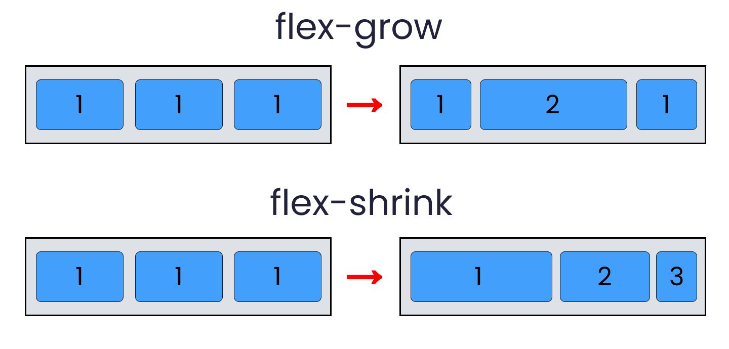
flex - grow | shrink | wrap
- flex-grow : grows the size of a flex-item based on width of the flex-container.
- flex-shrink : The ability for a flex item to shrink based on width of the flex-container. Opposite of flex-grow.
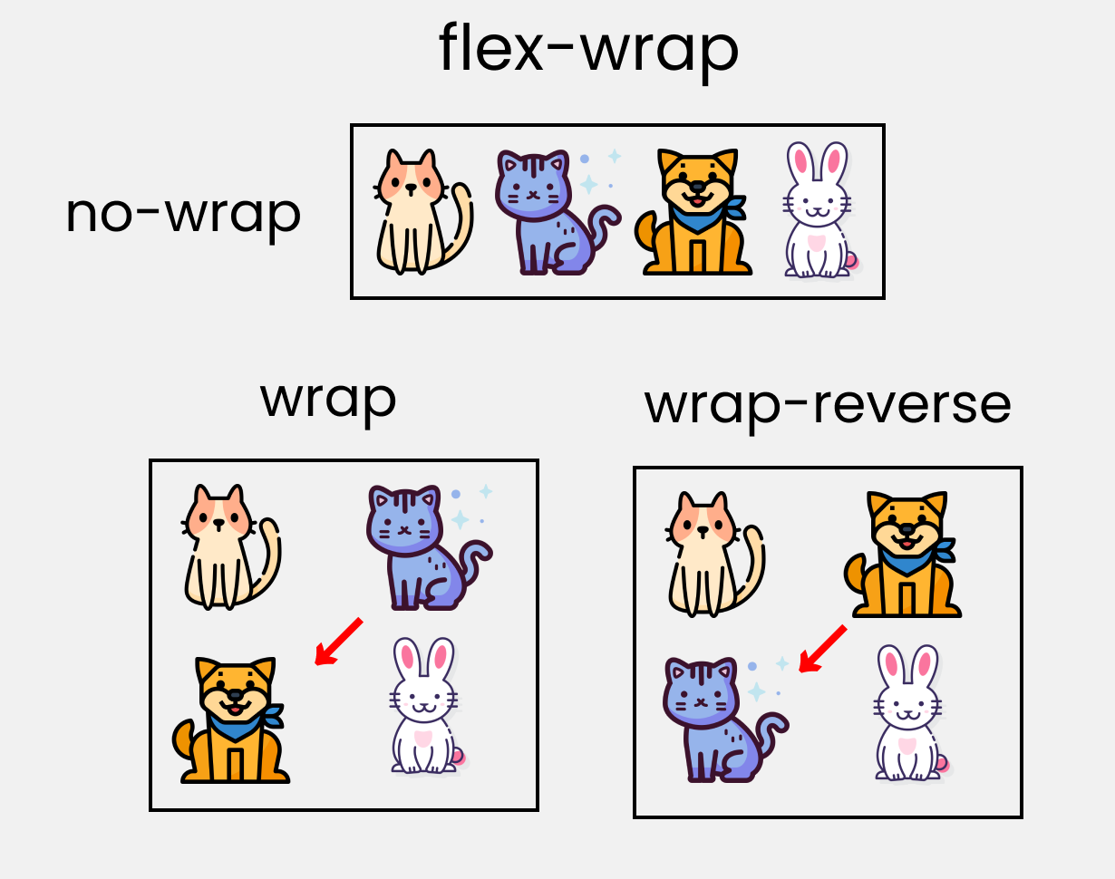
- flex-wrap : Amount of Flex-item you want in a line/row.
Short Hands
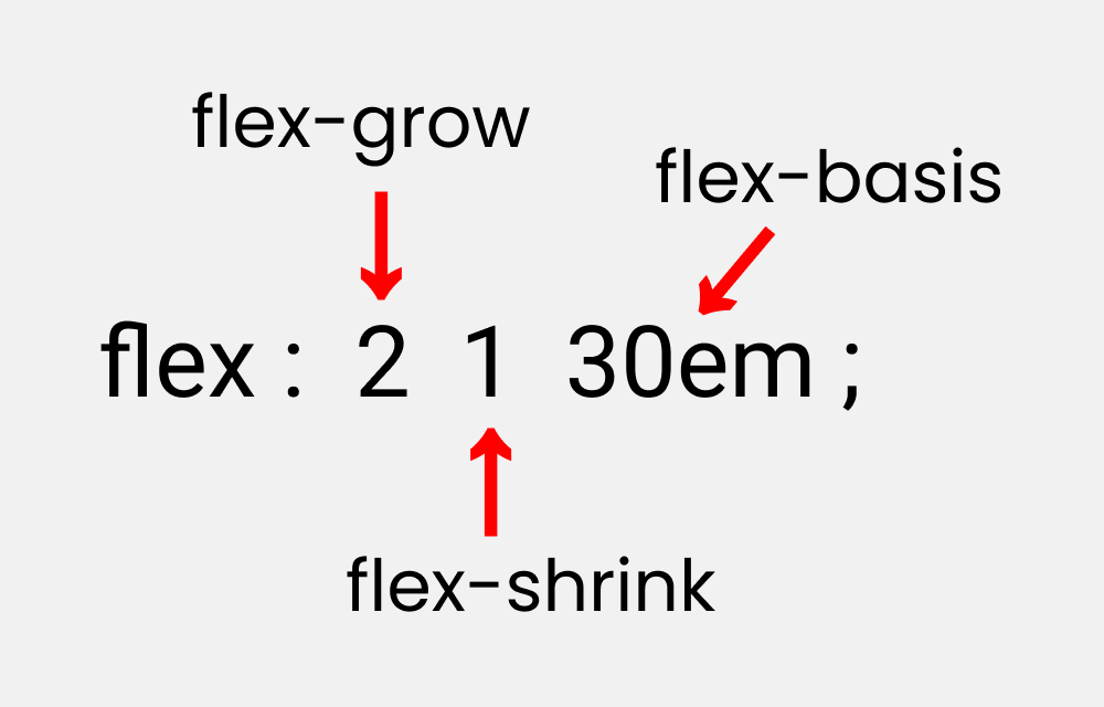
- flex : It is a shorthand to flex-grow, flex-shrink and flex-basis combined.
- flex-basis : This is similar to adding width to a flex-item, but only more flexible. flex-basis: 10em; it will set the initial size of a flex-item to 10em. Its final size will be based on available space, flex-grow, and flex-shrink.
Credits

Conclusion
Here's Your Medal For reading till the end ❤️
Suggestions & Criticisms Are Highly Appreciated ❤️


Youtube / Joy Shaheb
Twitter / JoyShaheb
Instagram / JoyShaheb