


Table of Contents :
- Grid Architecture
- Parent Properties
- Children Properties
- Short Hands
- Conclusion
Let's refresh Our CSS Grid Memory. Here's a Cheat Sheet of everything you can do with Grid to get started in 2021!🎖️
YouTube :
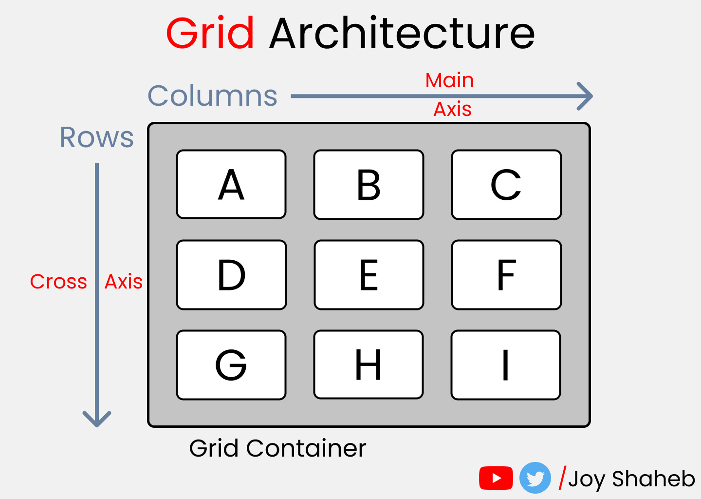
Grid Architecture
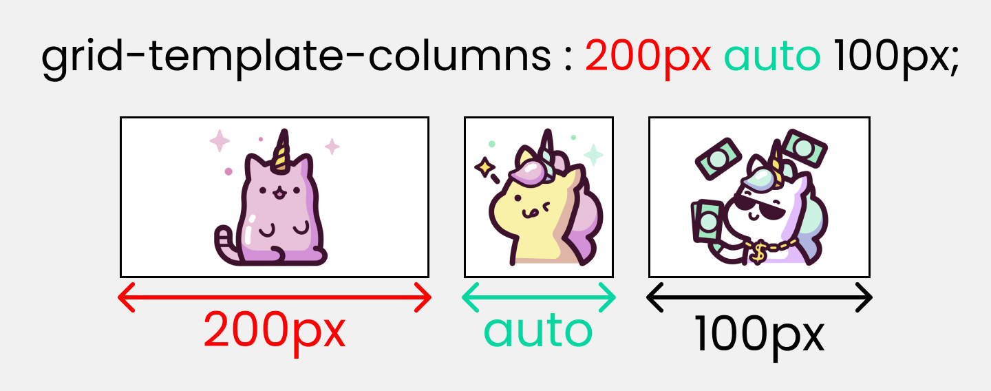
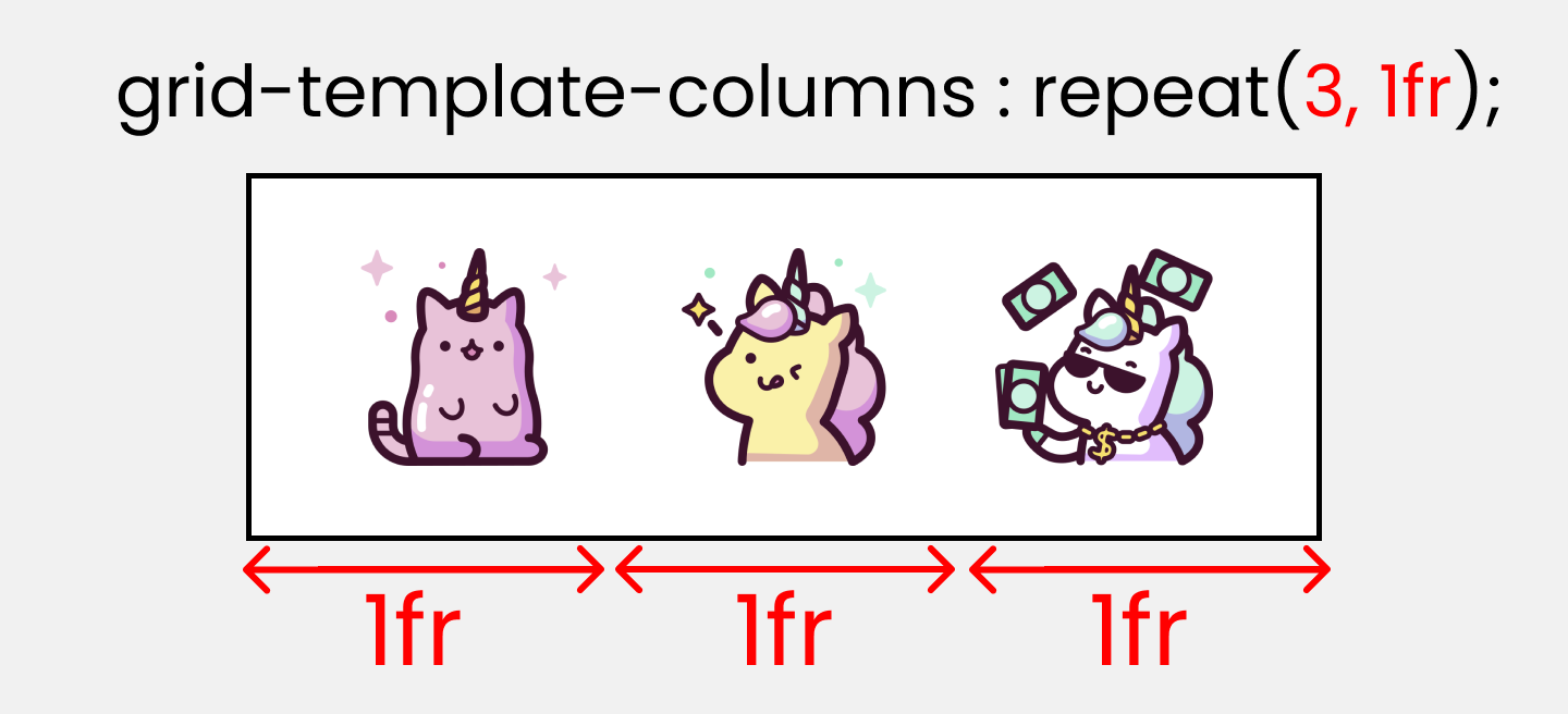
grid-template-columns
This is used to define the Number & Width of columns. You can either individually set the width of each column, or set an uniform width for all columns using "repeat()" function.
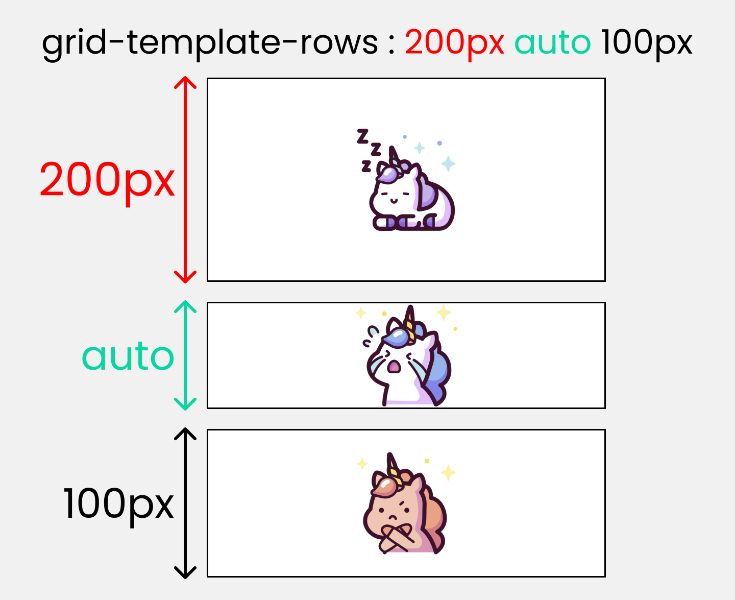
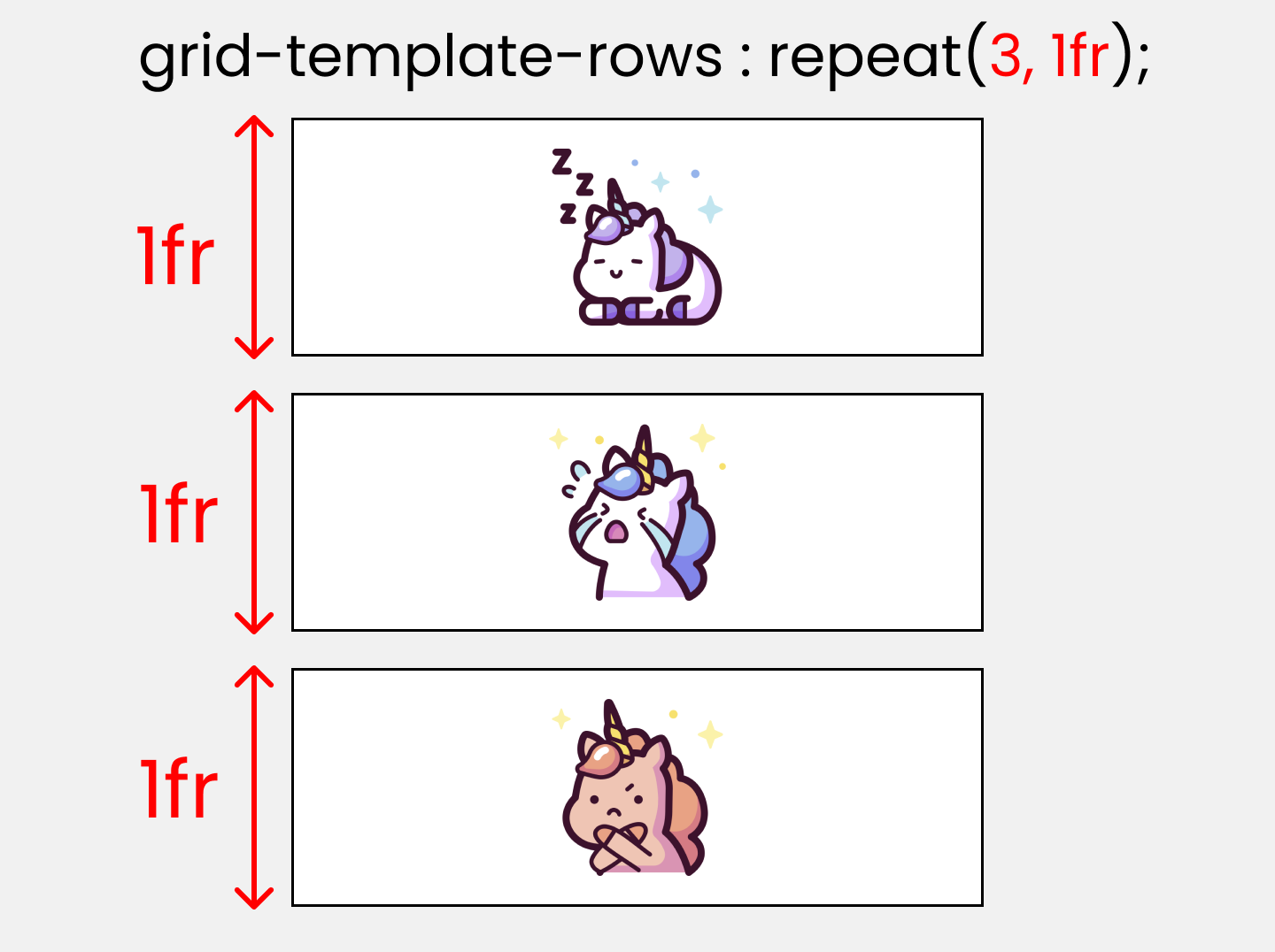
grid-template-rows
This is used to define the Number & Height of rows. You can either individually set the height of each row, or set an uniform height for all rows using "repeat()" function.
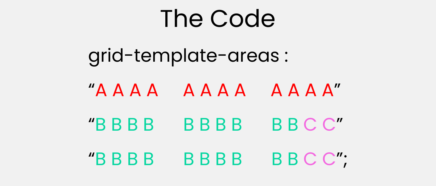
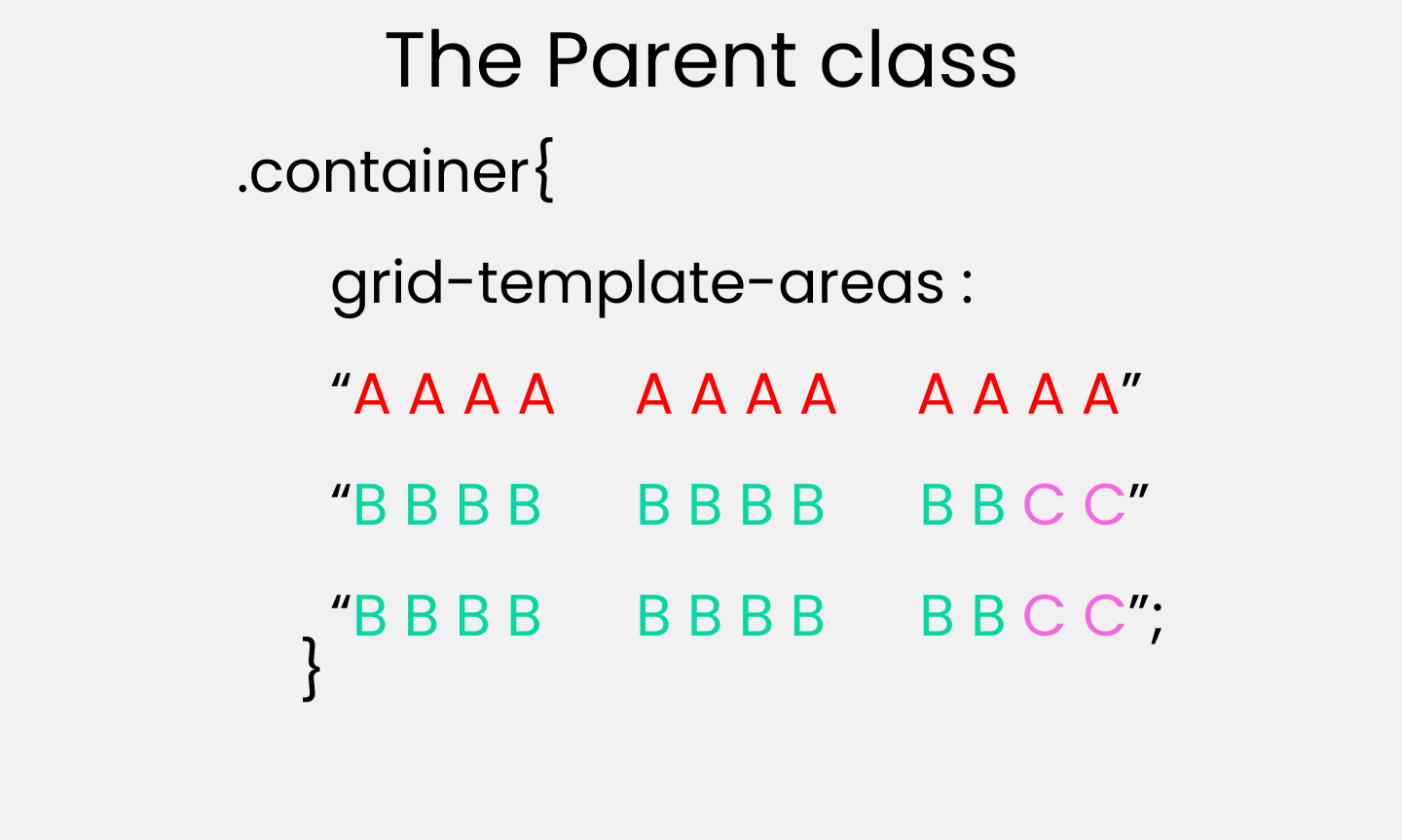
grid-template-areas
This is used to specify the amount of space a grid cell should carry in terms of column & row across the parent container. Life's Quite Easier With this as it allows us to see visually what we're doing.
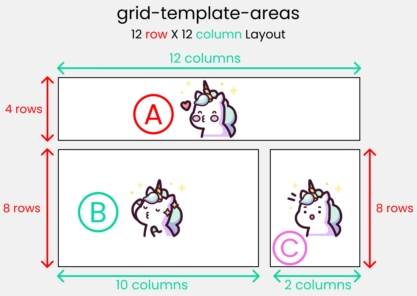
Call it, the blueprint(template) of our layout👇
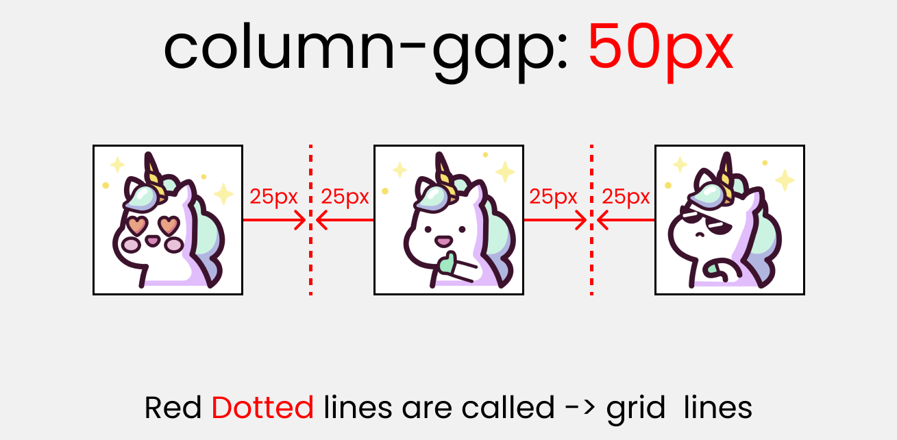
column-gap :
This property is used to place gap between Columns inside the grid 👇
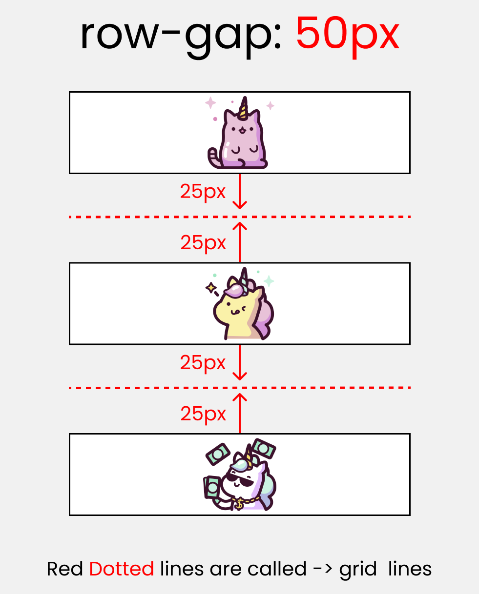
row-gap :
This property is used to place gap between Rows inside the grid 👇
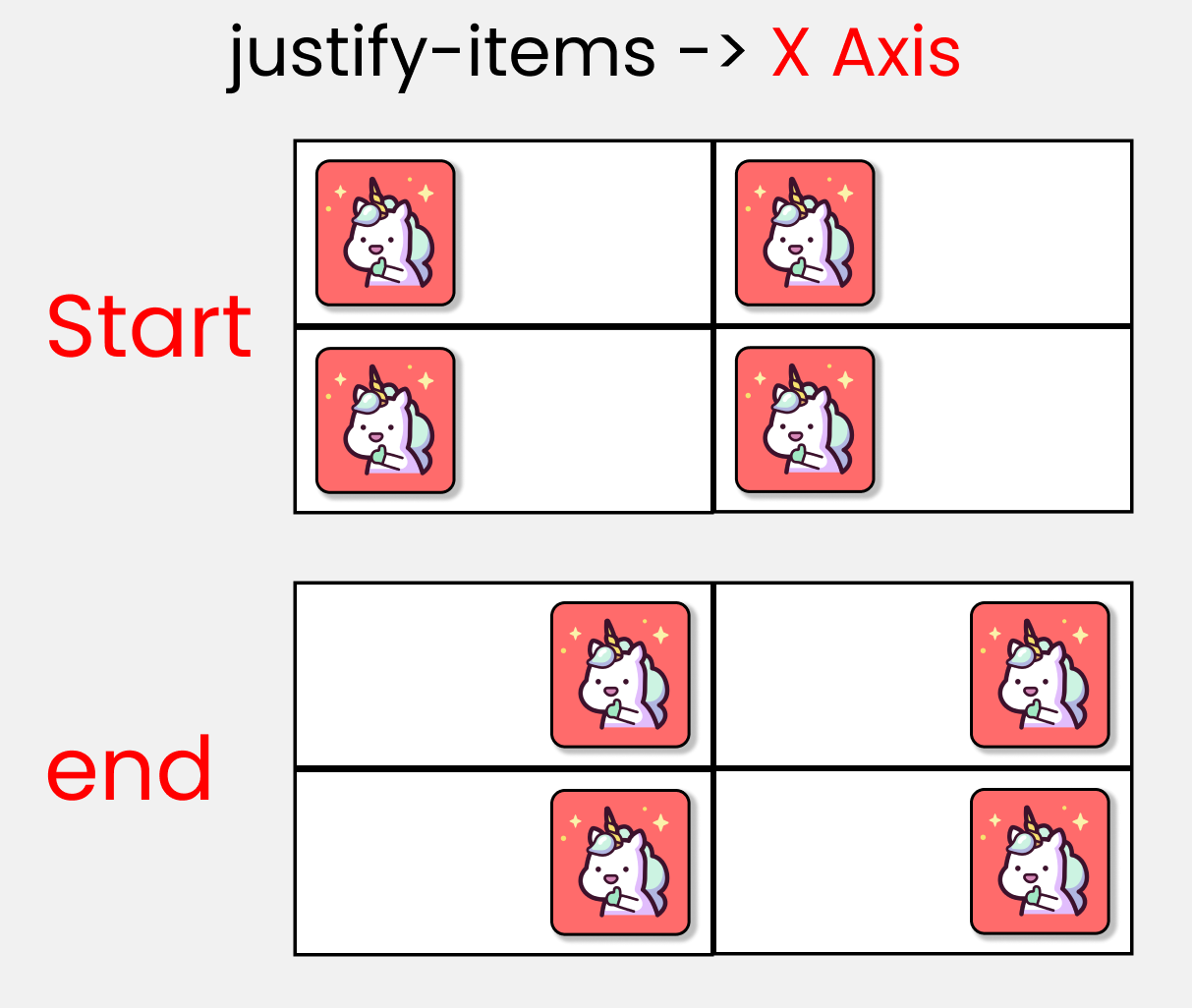
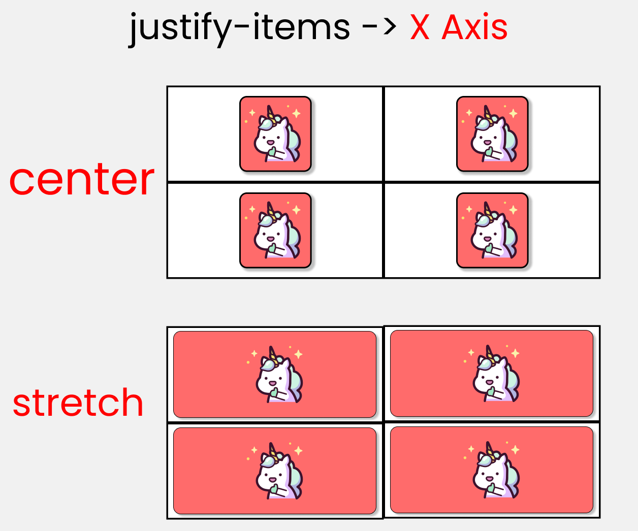
justify-items :
This is used to position grid-items (children) inside grid container along the X-Axis[Main Axis]. The 4 values are 👇
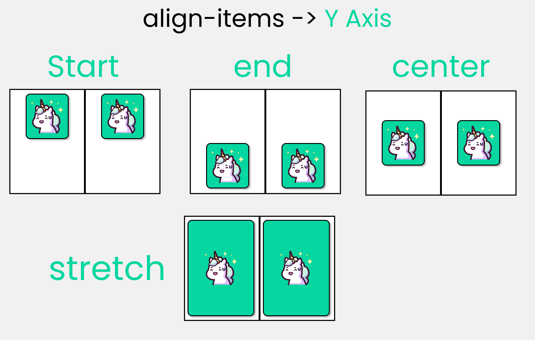
align-items :
This is used to position grid-items (children) inside grid container along the Y-Axis[Cross Axis]. The 4 values are 👇
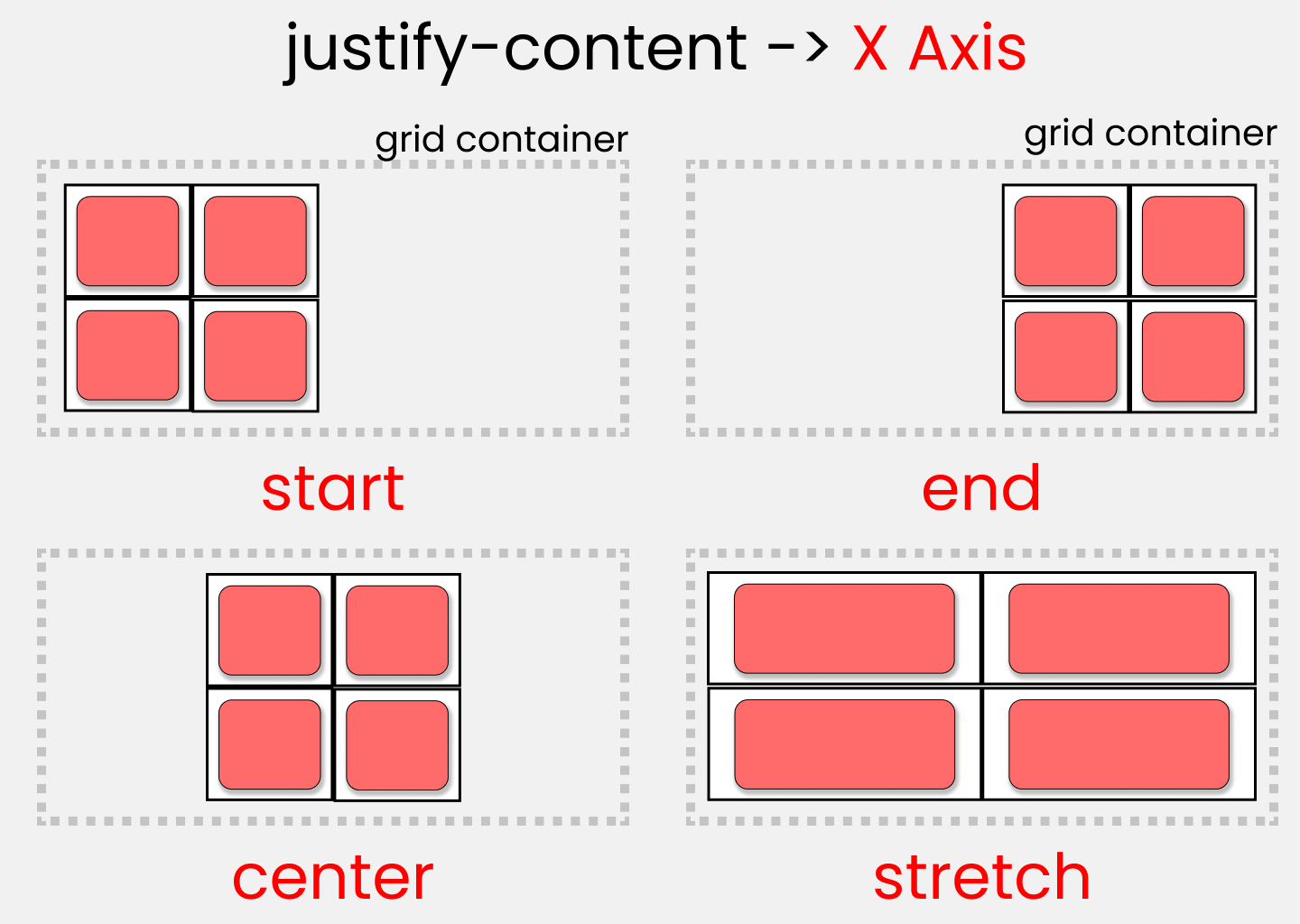
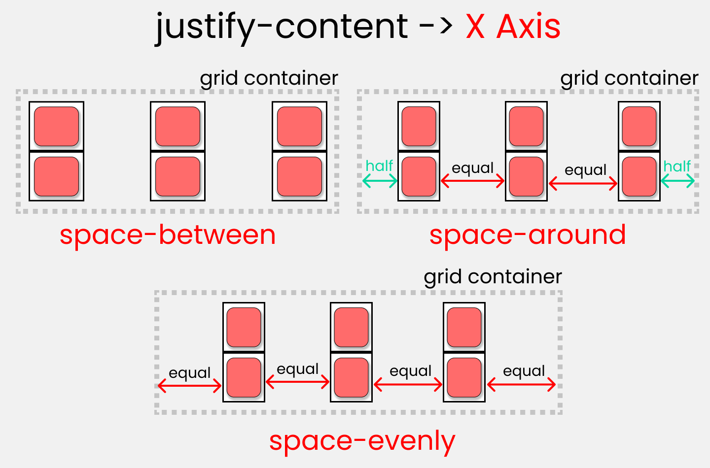
justify-content :
This is used to position our grid [Basically everything] inside grid container along the X-Axis[Main Axis]. The 7 values are 👇
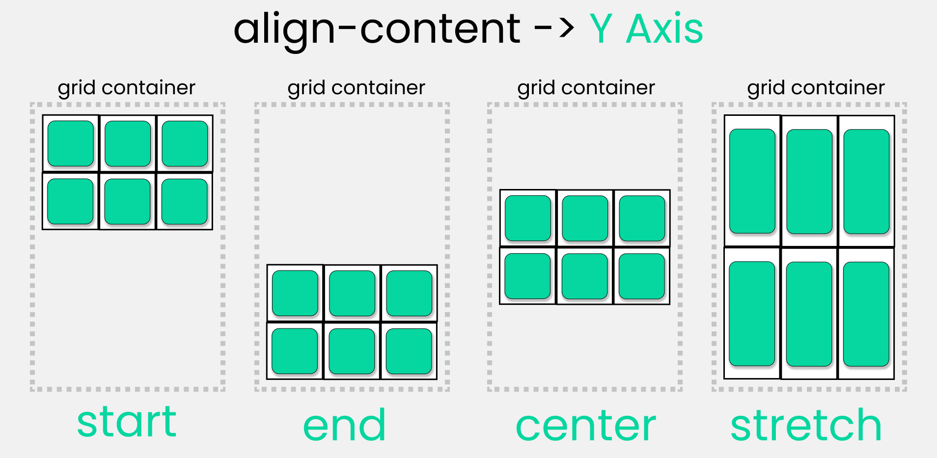
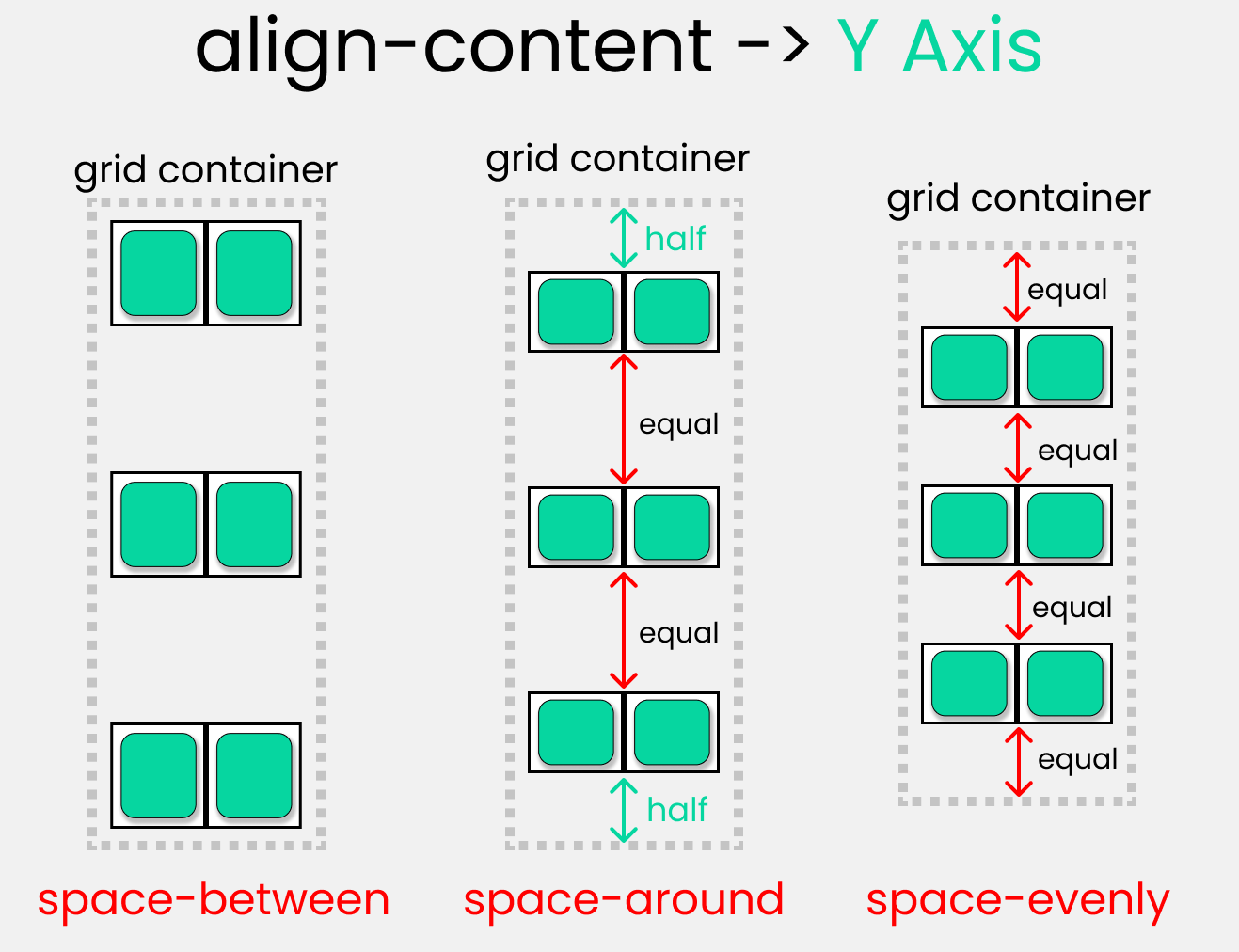
align-content :
This is used to position our grid [Basically everything] inside grid container along the Y-Axis[Cross Axis]. The 7 values are 👇
Children Properties

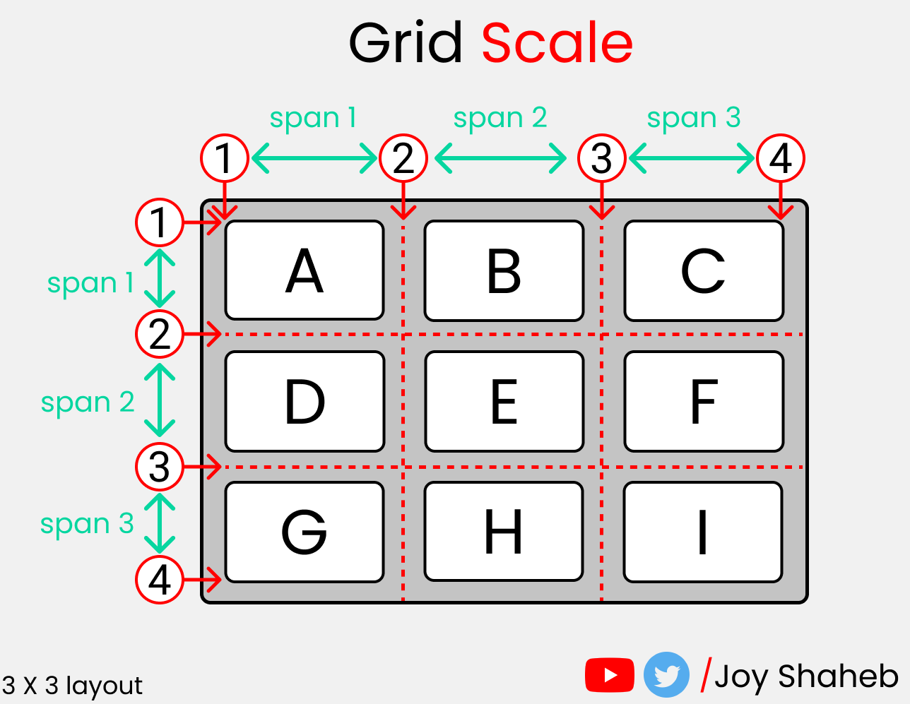
The Grid Scale
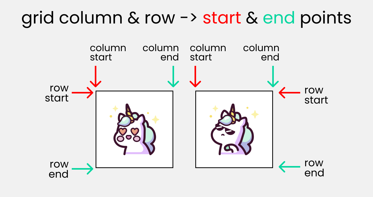
grid-column : start/end
THESE 2 properties are used to join multiple COLUMNS together. It is a shorthand of grid-column-start & grid-column-end Skip to this topic on the video above if you're confused using the timestamps.
grid-row : start/end
THESE 2 properties are used to join multiple ROWS together. It is a shorthand of grid-row-start & grid-row-end Skip to this topic on the video above if you're confused using the timestamps.
grid-area :
At first, we need to setup grid-template-areas ☝️ Once done, we have to specify the names used in parent class inside the children classes, like this👇
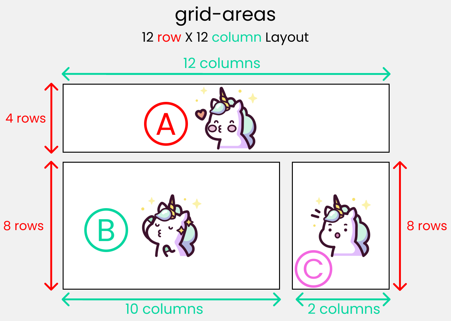
Specifying grid-template-areas inside parent container 👇
specifying the names used in parent container inside children classes with grid-areas👇

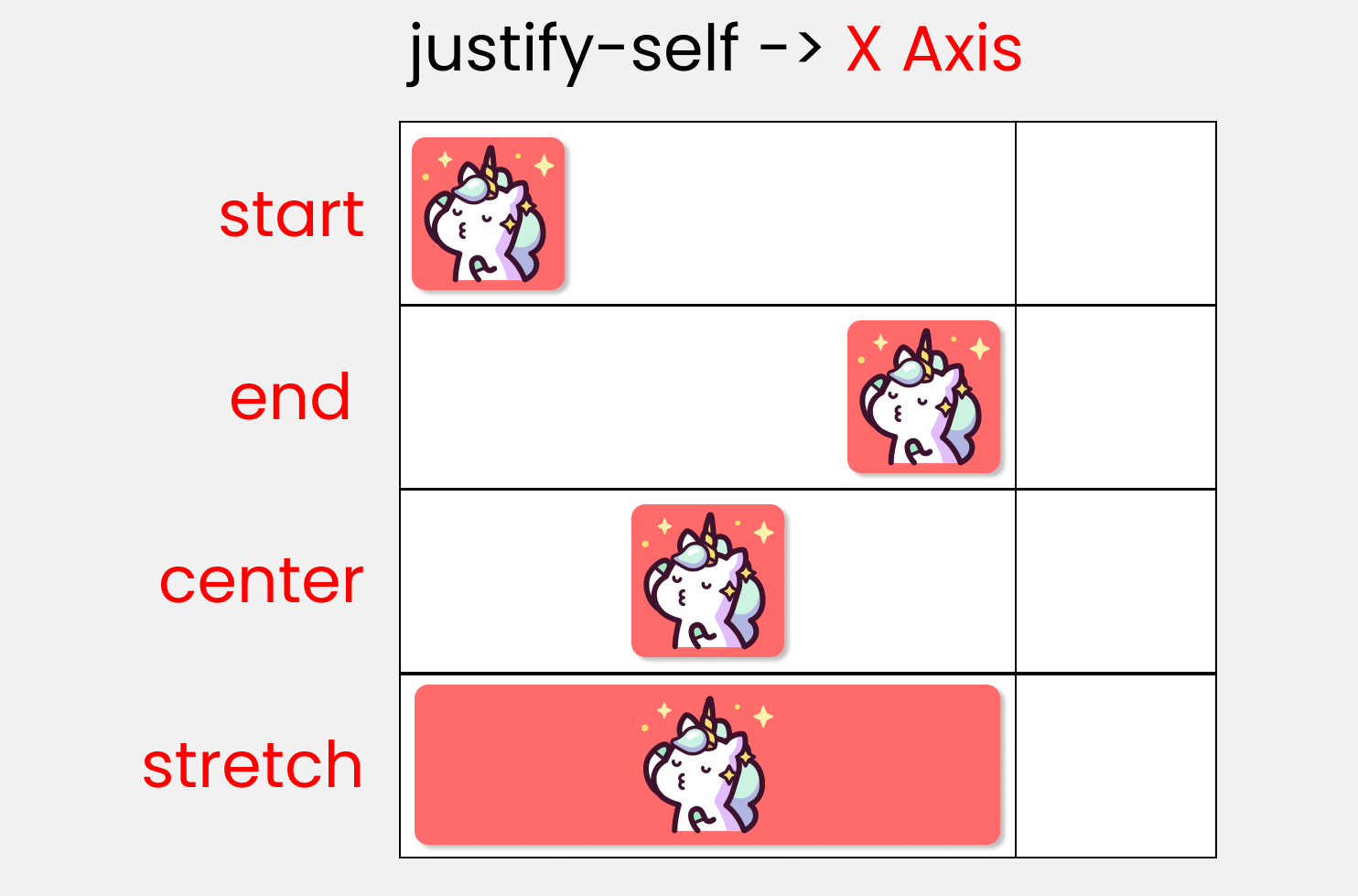
Justify-self :
This is used to position 1 individual grid-item (children) inside grid container along the X-Axis[Main Axis]. The 4 values are 👇
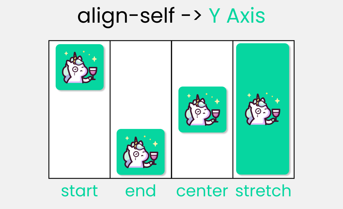
align-self :
This is used to position 1 individual grid-item (children) inside grid container along the Y-Axis[Cross Axis]. The 4 values are 👇
Short Hands

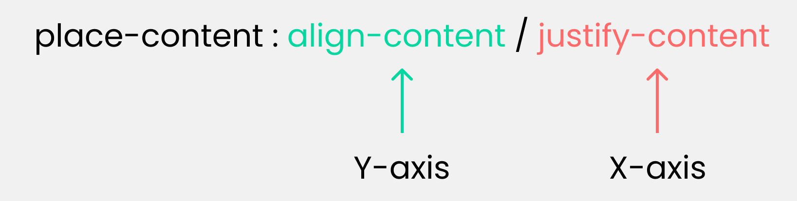
place-content :
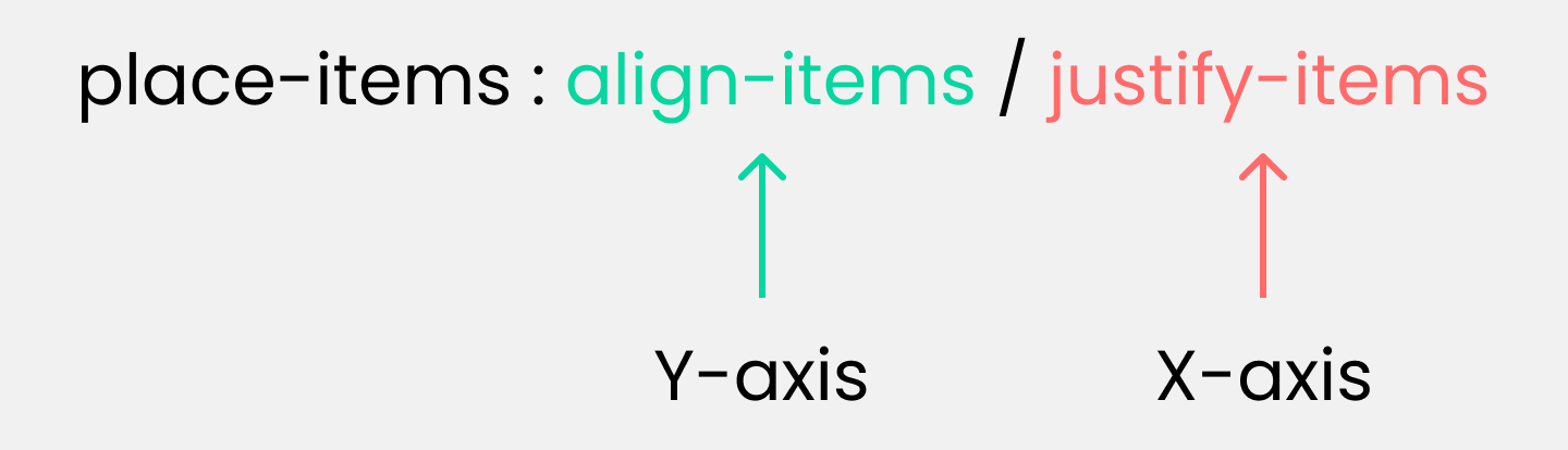
place-items :
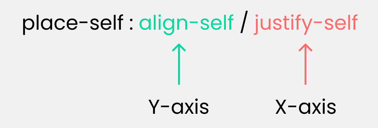
place-self :
grid-template :

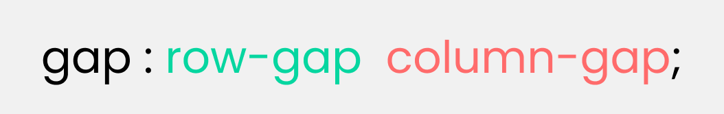
gap/grid-gap :
Credits

Read Next :
Conclusion
Here's Your Medal For reading till the end ❤️
Suggestions & Criticisms Are Highly Appreciated ❤️

YouTube / Joy Shaheb
Twitter / JoyShaheb
Instagram / JoyShaheb